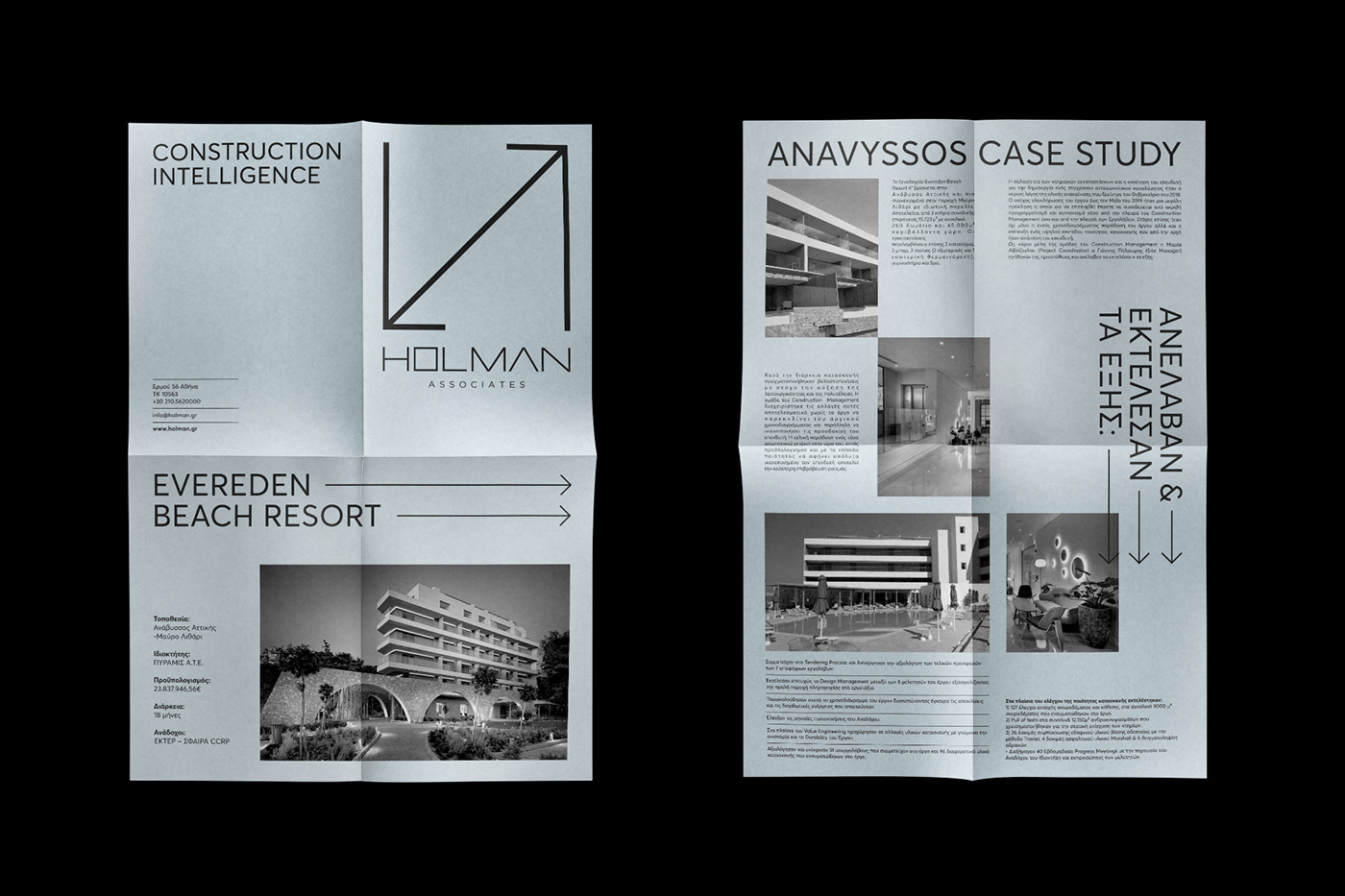
A bottom-up branding project with naming, slogan, logotype, corporate ID, signing, clothing, webpage design and a variety of analog and digital applications for a premium project and construction management brand, expertized in hotel industry.
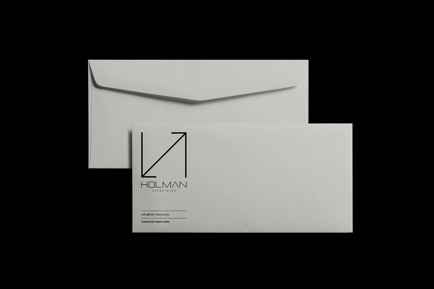
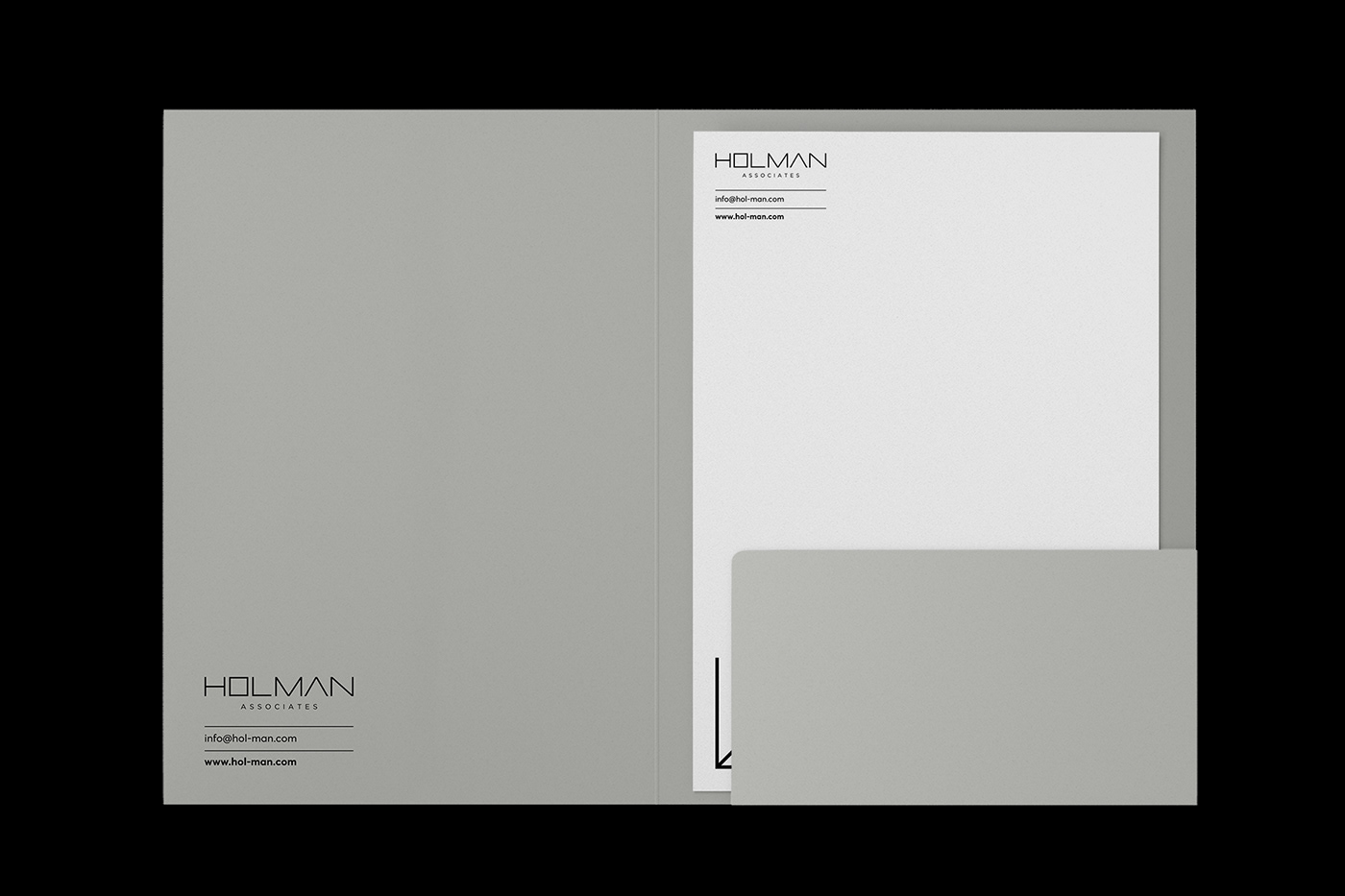
We installed the simplest 2D element, the line, at the foundation of the branding visualization process, as to lead and form both logotype and typography. Arrows: direction signs and tools to manage a complex task and achieve a successive fulfillment. These signs are located within a framework in an absolute balance, while the assemblage is not far from shaping the initials ‘’H’’ and ‘’N’’ of the brand. As a result, the architectural and abstract logo handily communicates an intelligent, robust, holistic management. Following, we came up with a 100% custom typography, such as to communicate a modern spirit of order and ambition. It so clear and it transmits the message ‘’trust your vision to HOLMAN associates’’. The color pallet needed nothing more than black and white, with an industrial grey contributing to the evolvement of the corporate ID. In its turn, it developed as a visual communication system, which symbolizes the information collection and the appropriate arrangements that make management effective. The ID surrounded by various analog and digital applications, integrated in the project to communicate toward the market the philosophy of the brand: construction intelligence.
Curation and Program Management:
Vassilios Bartzokas for the Design Ambassador - www.thedesignambassador.com